Swordsmith's Dojo
Built with Unreal Engine 4.27
View the final project on Artstation
Short flythrough of the scene on YouTube
Timelapse of me making all this: Part 1 |
Part 2
As luck would have it I managed to snag a large set of assets from Synty Studios when they had a humble bundle sale. I've always loved their work, all the way back to the "simple poly" series so it was a no brainer to pick them up. At this point you'd be hard pressed to download a mobile game that doesn't use Synty's work but I suppose that just speaks to the high quality of their product.
And so I sat on these for awhile. I opened up the packs in Unreal, took a tour of the demo maps for each one, sketched out a few ideas and then nothing. Then one fine morning I had the idea that maybe combining two wildly different asset packs would be a fun thing to try. A mishmash, kit bash that would bring out the contrasts. This felt like a fun art challenge but which two packs to choose? In one of those moments where your brain draws a line between two completely different things for no apparent reason I had a sudden childhood memory of seeing this photo in a magazine:
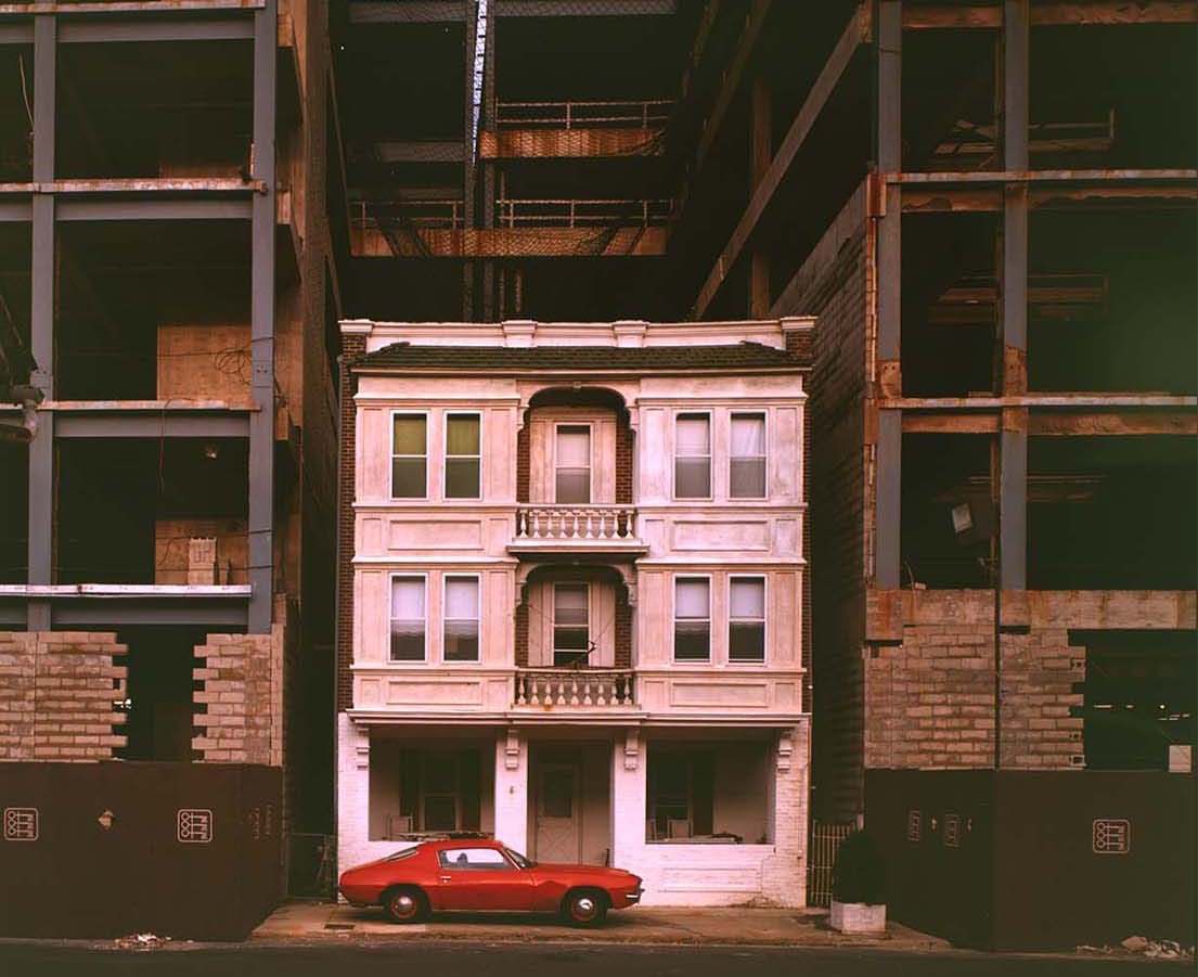 Casino construction in Atlantic City*
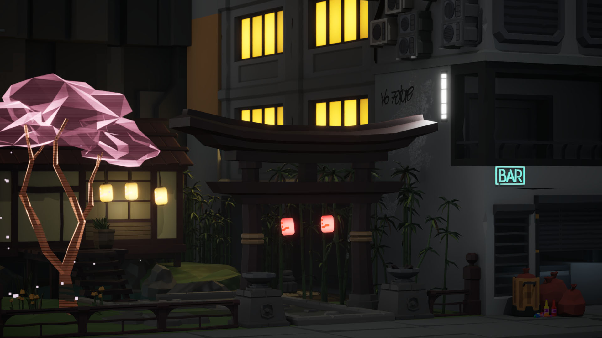
Taken in Atlantic City the person who owned this house had refused to sell out to the casino being built and so the architects were forced to design a giant building all around the property. At the time I remember thinking the person was stark raving mad for not taking the money but the image of the construction dwarfing the house apparently stuck with me. And so I thought it would be fun to take something old school (Japanese samurai) with something modern (the cyberpunk pack) and recreate this image, especially the sense of scale. With a direction in mind I could finally get started.
The first few days were just me figuring out what meshes I should use for the dojo and what meshes would look imposing next to it. I spent a lot of time with the demo maps of each pack just wandering around and making notes on how they used the various parts of the kit. In hindsight this was a little bit of a waste of time, it would have been better to just grey box the overall level and get a sense of scale. By going straight to the assets I ended up allowing the scale of the meshes influence the final layout and design. Taking note of the average dimensions of the meshes and using that for scale would have made more sense.
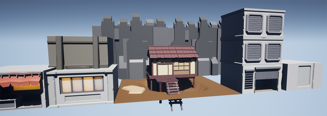 Moving meshes around to get sense of the scene
About halfway through (and a lot of rearranging of the parts) I started to feel pretty good about what I had and started playing with the lighting. I knew I wanted a night look so I removed the default sky, found a good HDRI for the skybox and started some basic lighting. This is one of those times when I can lose hours tweaking values and knew by experience that I needed to get back to finalizing the level before making a second pass.
At some point, and this happens in every project I work on, I started to feel deflated and bored with what I'd done. I think this is a product of looking at the same thing over and over again and no longer really "seeing" what you have done. As a result I started to experiment with some post process effects, specifically a subtle borderlands style cel shade effect and a cinematic LUT. This definitely had the effect of perking me up and getting me interested in completing the project.
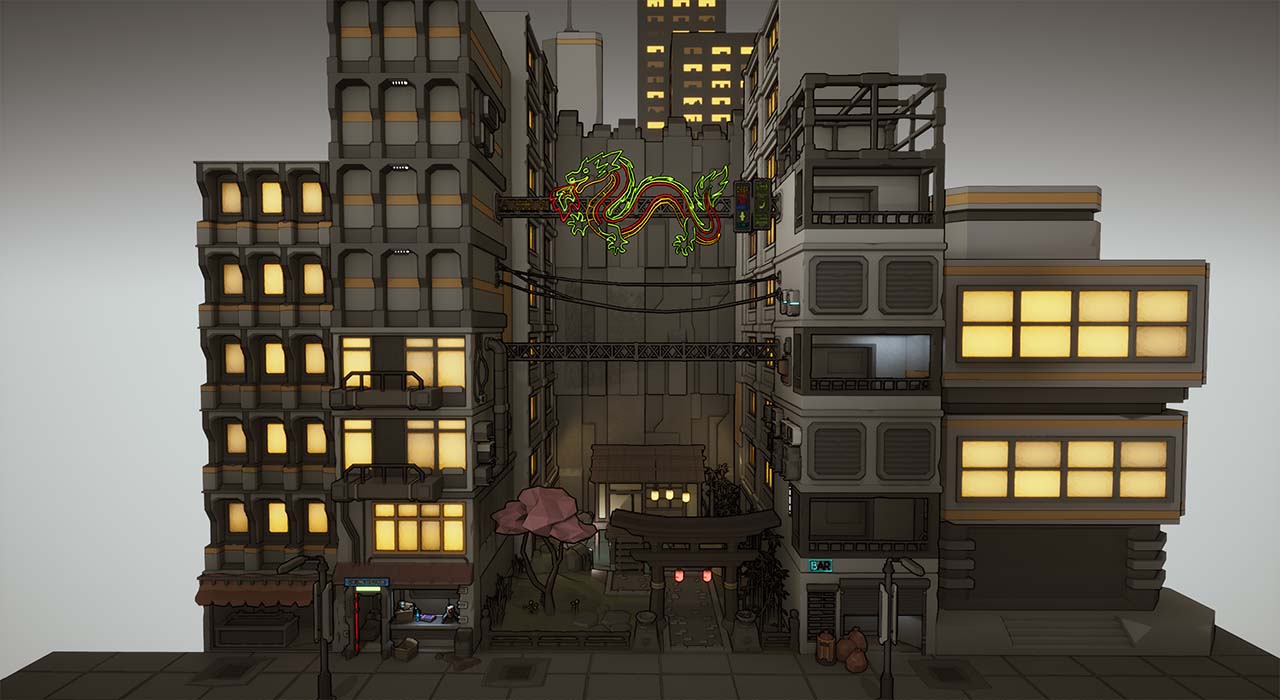 The entire level with cel shading applied
Now that it was starting to look like something I asked for some feedback from friends. They gave me some excellent ideas and pointed out places that seemed "wrong" but the best of the lot was the idea to turn the cherry tree model into a hologram to act as a bridge between the two worlds. Loved this idea but had no idea how to make a hologram material. Turns out its not that hard and thank you youtube for getting me the perfect answer so quickly. This tree represents the most custom aspect of the project and I like that I have my own stamp in there versus just using all the assets as is.
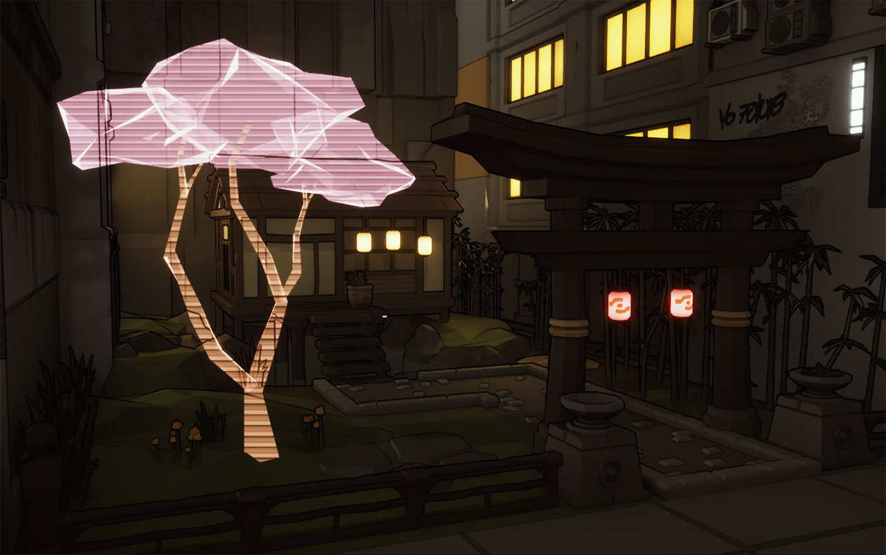 Early version of the hologram material
The final bits of the job were adding some grime to the buildings by using decals and adjusting the lights a million times. After a few test renders I decided I didn't like the cel shaded look all that much (it conflicted with the hologram tree) and removed it. Then I remembered the LUT and removed that too. Instead I dialed in the color/lighting so that it was mostly a cool city blue and the dojo could be a warmer yellow and red. More contrast made the difference here.
 One of the final renders with the Cel shadding and LUT removed. The scene now has a cool blue tone.
I knew I wanted some animation for this particular scene so I also added a swinging lantern effect using a timeline node to swing them back and forth. I gave each BP a public var for the swing amount to give them a little bit of variety. This could have been better but given they weren't the focus I didn't feel like customizing it further.
After I had rendered out the usual stills and a short walkthrough I had the idea to make a music video with the scene that would pair nicely with lofi hip hop. I very blatantly used LoFi Girl's amazing videos as inspiration, holding a single angle on the scene and letting the subtle animations do their thing. I used a track from Riot Games album Sessions Vi (a new space) that I felt matched the mood. The result was by far my favorite part of this project and would love to do more music based videos with Unreal in the future.
Music video version of this project * Quick back story about that photo inspiration (and without getting too political). Turns out the Casino was bing built by the Trump organization and so there's an excellent chance they would have cheated that homeowner out of their money anyway. Pretty sure both the Casino and the house are demolished at this point.